When I worked on the brand guidelines for Supermarket World, the question was not simply how to make an equipment business look more polished. It was how to make the business easier to understand, easier to buy from, and more consistent in the way it earns trust.
A supermarket operator replacing one refrigerated display does not need the same conversation as a team planning an entire store. Both deserve useful information and a clear next step. Neither should have to work through vague promises to understand what a supplier can actually do.
That became the organizing idea behind this project: build the brand around the customer’s equipment decision, not just around the company’s catalog.
The result is a 34-page brand guidelines document connecting positioning, messaging, visual identity, customer experience, and practical operating standards. This article explains the decisions behind that management-review edition, rather than presenting it as an already completed rollout.
Defining What Supermarket World Stands For
The starting point was the business direction supplied by leadership: Supermarket World serves supermarket and grocery operators, from independent stores to regional chains, with equipment solutions and support.
I wanted the positioning to communicate more than product availability. Equipment decisions involve dimensions, utilities, merchandising, delivery access, budget, and the consequences of getting the specification wrong.
We framed the business as an equipment solutions partner for businesses building and improving supermarkets and grocery stores.
That wording also establishes boundaries. Supermarket World is not a grocery retailer. It is not necessarily the manufacturer of the products it sells. And an equipment project does not automatically mean responsibility for every part of a store’s construction.
For me, good positioning makes a business more specific. It should help a customer understand both the value being offered and the questions that still need answering.
Two Buying Journeys, One Brand
One of the most important decisions was to separate customer journeys by the task, rather than the customer’s size.
A small independent operator may need help planning a complete store. A larger chain may only need a replacement unit. Treating every small customer as a simple transaction, or every large customer as a complex project, would miss what they actually need.
The guidelines therefore define two routes:
- Request a Quote for openings, renovations, coordinated equipment requirements, and projects that need a conversation.
- Shop Equipment for customers with a defined need who are ready to evaluate and purchase a product.
This has consequences beyond button labels. Project pages should explain scope, process, and relevant experience. Product pages should make specifications, configuration, price, and purchasing conditions easy to find.
Human support belongs beside the buying process. It should not become an unnecessary gate in front of a straightforward purchase.
Giving Atlantic the Right Role
Supermarket World’s relationship with Atlantic Restaurant & Supermarket Equipment was another important part of the work.
The brand needed its own supermarket and grocery focus while making its operational backing clear. We used the endorsement “An Atlantic company” to express that relationship in corporate introductions, proposals, and other first-touch materials.
We also documented how to handle the history. The leadership brief attributes the regional experience dating to 1998 to Atlantic. That should not quietly become a claim that Supermarket World itself was founded in 1998.
The same discipline applies to the company’s Kearny warehouse. Physical infrastructure can make a business tangible, but a warehouse is not evidence that every item is immediately available.
These distinctions may look like copy details. I see them as part of the identity: the brand should be precise about where its credibility comes from.
Translating the Strategy into a Visual System
We built the guidelines around the existing approved Atlantic Signature identity. The work was not about replacing every asset. It was about making the identity usable across different sizes, formats, and commercial situations.
A Logo System That Adapts
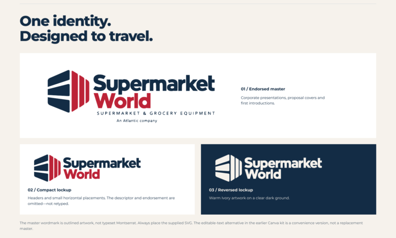
The store-inspired symbol and wordmark provide the foundation. We defined an endorsed master for corporate presentations and proposal covers, a compact version for smaller horizontal placements, and a reversed version for dark backgrounds.
The compact version preserves the original artwork while removing the descriptor and endorsement where they would become too small to read. It is a controlled adaptation, not a separately redrawn logo.
That distinction matters in everyday production. A full lockup can look strong on a presentation cover and become unreadable in a website header. Consistency means choosing the right approved version, not forcing the same arrangement into every space.
Color with a Clear Job
The palette gives each color a practical role:
| Color | HEX | Role |
|---|---|---|
| Atlantic Navy | #132C45 |
Structure, headlines, and dark backgrounds |
| Signature Red | #BC2337 |
Primary actions and deliberate emphasis |
| Warm Ivory | #F6F2EC |
Light backgrounds and breathing room |
| Steel | #77868F |
Restrained supporting detail |
I wanted the identity to feel experienced without becoming cold, and approachable without losing the seriousness of a substantial equipment purchase.
The guidelines also distinguish attractive combinations from readable ones. Red on navy is not approved for text; Steel is not the default for normal-sized text on Ivory. The document includes palette contrast checks, while leaving full interface accessibility testing as a separate implementation responsibility.
Typography and the Store Frame
Montserrat provides the supporting type family, with defined roles for headlines, body copy, labels, prices, and captions. The logo remains supplied artwork; it should not be recreated by typing the company name in the brand font.
We called the supporting layout approach the Store Frame. It takes its cue from store organization: clear zones, open circulation, and a visible focal point.
On a page, that means separating the customer need, the equipment information, and the next action. On mobile, it means preserving that reading order rather than shrinking a desktop composition until everything becomes difficult to use.
A Voice That Helps Customers Decide
The personality is built around three qualities: experienced, dependable, and approachable.
Those words needed to become usable writing rules.
Experienced means asking for the information needed to make a useful recommendation. Dependable means distinguishing confirmed facts from details that still require checking. Approachable means offering help without making the customer feel pressured or out of their depth.
Instead of broad claims about having the best solution, the voice should explain what matters: available space, electrical supply, delivery requirements, and the intended use.
The proposed campaign line, “Built around your store,” brings that thinking together. It puts the operator’s needs first without suggesting that every sale includes a complete store build.
Making Evidence Part of the Brand
In equipment marketing, a strong visual presentation cannot compensate for an unclear promise.
We made claim controls part of the guidelines. Delivery, installation, financing, and support need conditions that reflect the actual product, location, provider, and project scope. A conditional shipping offer should not become a permanent badge implying that every order qualifies.
Photography follows the same principle. Show real equipment, the correct product configuration, and permissioned installations. Explain the company’s actual contribution to a project rather than implying responsibility for the entire store.
The document also draws a clear line around AI-generated imagery: it can illustrate a labeled concept, but it should not stand in for a completed customer project or verified technical evidence.
I consider that a branding decision, not just a publishing precaution. The way a business handles evidence is part of the experience of trusting it.
Extending the Identity Beyond the Website
The guidelines carry the same principles into social content, proposals, signage, print, and workwear.
For social content, we defined recurring families such as The Equipment Edit, Before You Buy, and Store Projects. Each has a different job: introduce a relevant product, answer a buying question, or demonstrate real experience.
For sales proposals, the priority is clarity about equipment, inclusions, exclusions, site requirements, commercial terms, and responsibility for delivery or support.
A proposal that leaves those questions unanswered is not rescued by a good cover design. The visual identity and the quality of the information have to work together.
What This Phase Delivered
This phase produced a documented standard for how Supermarket World can communicate and apply its identity: positioning, the Atlantic relationship, buying journeys, messaging, logo usage, color, typography, layout, and illustrative applications.
It also sets out review responsibilities and a staged rollout. The next steps are management adoption, confirmation of assets and claims, implementation, and evaluation in real use.
The guidelines do not establish that the proposed website has launched, that customer interviews have taken place, or that the identity has increased sales. Those are separate activities and outcomes that require their own evidence.
My main takeaway from this work is that B2B branding should make the business easier to deal with. A recognizable identity matters, but so do the product information, the quote, the next step, and the limits of a promise.
For Supermarket World, that is what building a brand around the store means: helping the operator make a better-informed equipment decision, from the first impression to the practical details of the purchase.
